
In our world now, considering the era of the internet, information overload will tend to flood our heads. And the only way to take them in without getting crazy is our ability to organize information. This is where graphic organizers come in. One of which are the graphs.
TYPES OF GRAPHS

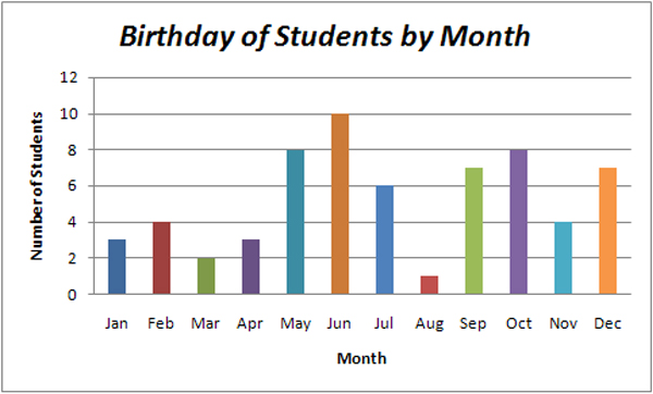
🔰BAR GRAPH
- Represented by spaced rectangular bars describing data points in a set of data.
- X-axis / horizontal axis usually represents categories being compared while the Y-axis / vertical axis represents the frequency or value of the given category.
--------------------------------------------------------------------
🌸Uses of Bar Graph
✔ highlight differences between separate values
✔ compare values in different categories
✔ describe relationships of several values at once
✔ summarize a large data set in an understandable form
(visual form)
✔ estimate key values

--------------------------------------------------------------------
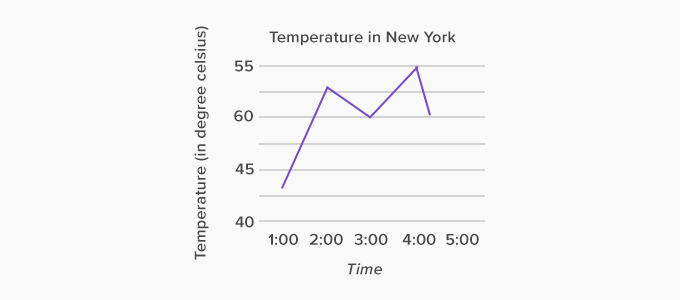
🔰LINE GRAPH
- Represented by a group of data points joined together by a straight line.
- X-axis / horizontal axis usually represents the independent variable while the Y-axis / vertical axis represents the dependent variable.
- May ascend, descend or do both depending on the data assessed.
- Sometimes referred to as time-series chart
--------------------------------------------------------------------
🌸Uses of Line Graph
✔ shows how data changes over time
✔ show trends and relationships between data
✔ compare trends in different groups of a variable
✔ show multiple series of closely related data

--------------------------------------------------------------------
🔰PIE GRAPH
- A circle divided into different colored areas to depict parts of a whole.
- Each sector in the pie represents proportion of a particular set in which the numbers graph as percentages.
--------------------------------------------------------------------
🌸Uses of Pie Graph
✔ illustrate percentage breakdown of a small number of
data points
✔ summarize categorical data or percentile value
✔ provide excellent visual concept of a whole
✔ highlight information by visual separation of a segment

--------------------------------------------------------------------

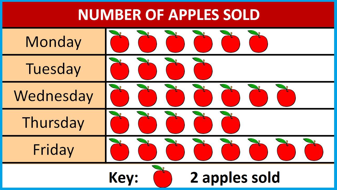
🔰PICTOGRAPH
- A way of showing data using images.
- A variation of bar graph
--------------------------------------------------------------------

--------------------------------------------------------------------
References:
Karen, G. (2021, September 25). The difference between charts & graphs. sciencing.com. https://sciencing.com/difference-between-charts-graphs-7385398.html
Formplus. (2020, April 17). 11 Types of Graphs & Charts + [Examples]. formplus. https://www.formpl.us/resources/graph-chart/
Pierce, R. (2017, January 31 ). Pictographs. Math is Fun. http://www.mathsisfun.com/data/pictographs.html
Advantages and disadvantages of different types of graphs. (2011, April). ROM. http://www.kmrom.com/Site-En/Articles/ViewArticle.aspx?ArticleID=416
Types of graphs. CFI. https://corporatefinanceinstitute.com/resources/excel/study/types-of-graphs/
Originally published in
September 25, 2021
@ jeanillec.blogspot.com


No comments:
Post a Comment